When discussing chart design, do spreadsheets filled with numbers and conventional pie charts in PowerPoint immediately spring to mind? My perspective, however, extends beyond cluttered tables to a realm where information is not just presented but transformed into a compelling narrative through visual storytelling. Here are a few common yet impactful ways to visualize your PowerPoint content:
1. Text + Numbers
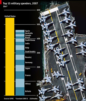
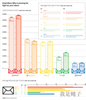
Combining text and numbers is a tried-and-true method of communication. This straightforward approach, which has evolved from simplistic bar graphs and pie charts into richly designed graphical elements, remains a cornerstone of data visualization. The key lies in concise, easily digestible text and clear, unambiguous numbers. For instance, when illustrating global military spending in 2007, clarity is crucial to avoid misinterpretation – where each color block’s height, not the distance from the base to the country name, represents the expenditure.

2. Graphics + Symbols
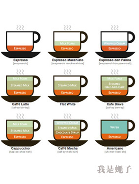
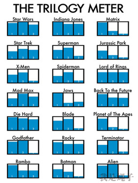
Graphics paired with symbols constitute a potent and versatile means of conveying complex ideas simply and engagingly. These visual elements imbue data with life, transforming dry statistics into vivid, relatable narratives that transcend linguistic barriers. An illustration mapping out various coffee types, for example, not only educates viewers on the composition of their favorite lattes or cappuccinos but also adds a touch of fun and personality.

3. Color Schemes and Layouts
Color plays a pivotal role in visual communication, as demonstrated by maps that use color blocks to differentiate between concepts. Skillful application of color by designers can simplify comprehension, distinguishing between similar yet distinct entities and reducing cognitive load. Companies like Golden Section, specializing in chart design, create visually stunning graphics for newspapers and magazines, such as an infographic mapping global happiness indices based on a survey conducted by The Globe and Mail. Even without granular detail, such visuals provide a snapshot of worldwide living conditions.

These are but a few broad categories within the vast landscape of chart design. There’s always room to explore further, and sharing innovative approaches is invaluable. While not everyone aims to become a professional infographic designer, incorporating these principles can significantly elevate your PowerPoint presentations.
